How effective is the combonations of your music products and ancillary texts?
Our music video took up the majority of our time to begin with, once we had completed this we decided to focus more of out time on the digipak and other ancillary products such as the website and magazine article.
As we are a new band we needed to make sure that we included suitable iconography and synergy between all of our products so our audience are able to see a connection between all of our products and relate them back to the band. Everything has to work together and look good as a package, if it didn't it would look very unprofessional.
We also created different forms of marking campaigns on social media and our website to boost the authenticity of the band. Our main goal of our marketing campaigns was to put across an image, one that audiences could relate to. We wanted to make sure that throughout all our products we looked like a fun, youthful, friendly band, as we each had our identity/personalities within the band we wanted this to be evident alongside looking unified as a band.
For the website we wanted the home page to contain all three of us, this is as it is the first photo the user sees when they open the web page. The image had to show clearly that we are a band, it also had to successfully put across our genre of music and style of the band. We decided to go with an image that was also used on our digipak this would mean that there was a connection through both products creating synergy and potentially making them both look more successful.
Female bands such as Little Mix and M.O use images like these themselves. This makes them appear as a typical pop girl band, something that we wanted to come across as on our website.
Above shows the image that we decided to use on our website, we used iconography through the use of light flares which are also used on our digipak and music video. This is because our both our first single and album, titled Light Me Up, meaning lights became an icon for our page, they are shown on every page of our website in the background.
We made sure that this was consistent throughout all of our products, making them very effective when combined.
Above shows an image that we used on out digipak, it is from the same photoshoot that we show on our website, allowing a visual link to be created with both products.
As we are a new band we needed to apply synergy and iconography to all our media campaigns, this would initially help them to be noticed in the growing industry by both the target market and others. Our target audience is aged between 11-14, they are interested in pop music. As they are in their teenage years we would also expect them to be interested in things like social networking . Through research and alysis of similar artists ancillary products we were able to take inspiration and adapt it to suit out band.
We knew that the digipak needed to be colourful and lively to represent our music, we also knew that it had to fit and match without other products for them all to be effective and work together. e decided colour be the thing unifying all our products. Each member of the band has their own inidvidual colours associated with them, these are so each member can become recognisable as having their own identity within the band.
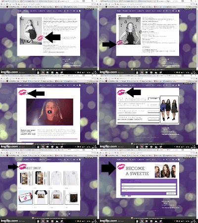
On both our digipak and website and digipak we used iconography, this helped to create synergy through our products this was necessary due to us being new band we needed something for people to associate us with. We used pink lips on both products, we also had close ups shots of lips in our music video.
We also needed to make sure that there was a running theme throughout all the products they needed to be able to blend together and each part needed to be instantly recognisable with each other. The theme of lights is one factor that allows this, another is the colours and as there is a lot of UV lights in our music video this gives another theme. Our main colour connecting everything is purple, we decided to go with this colour as it carried the connotations of royalty and power and as we have a younger audience we wanted to take influence from bands like Girls Aloud and Little Mix who are all about girl power. Using this colour shows that we aren't just a girly pop band but we are powerful, we want to come across as good role models to out audience.


